zondag 28 april 2019
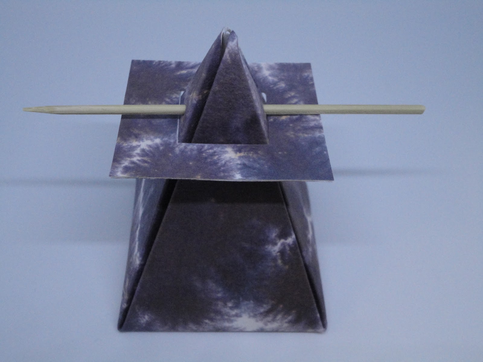
marbled box nr 2
Voor de tweede doos (*), werkte ik met dit ge-azijnmarmerd blad.
This was the (vinegar marbled) paper I used for box nr 2 (*)
Het blad was al druk op zichzelf, dus wou ik er niet te veel tekst aan toevoegen. Enkel aan de rand schreef ik wat kleine kapitaaltjes. Maar omdat ik het papier vergeten was in te spuiten (met haarlak) alvorens te schrijven, 'liepen' de letters erg uit. Normaal zou ik het dan weggooien, maar hier vond ik het wel passen bij de achtergrond en liet ik het maar zo. Op de 'flanken' gebruikte ik nog een art stamp alfabet-stempel en paars distress embossingpoeder.
The background paper was rather 'busy' , so I didn't want to add too much text.
I only added some textlines on the borders, which started to bleed immediately...Oops forgot to spray the paper (with hairspray) before writing ! Normally in such cases I would toss away the paper, but because it kind of 'fitted' in with the background, I decided to leave it this way. On the sides of the box you can also see an alfabet-stamp by art stamp embossed with purple distress powder by Jim Holtz.
(*): ontwerp / design by Susan Brzozowski, found on Pinterest
Boxes nrs 3 and 4 : end of May
zondag 21 april 2019
vinegar marbling + box - azijnmarmeren+doosje
stond een projectje met azijnmarmeren. Huh ? Azijnmarmeren ? Dat was inderdaad ook mijn eerste reactie. En natuurlijk moest dat ook eens uitgetest worden...
In the latest issue of the (Dutch) magazine "Letterpalet" (more info on this magazine here), there was a DIY project involving marbling with vinegar! Yes, vinegar !
So of course this needed some testing.....
Op een groot stuk Zerkal-papier smeerde ik het azijnmengsel uit en drupte wat ecoline.
I took a big piece of Zerkal paper on which I poured some of the vinegar mix and dropped some ecoline.
| nog nat - still wet |
| droog - dry |
En enkel met zwarte ecoline
Only with black ecoline:
En tenslotte de laatste hoek van het papier, terug met de blauw-groene gouache.
And for the last corner of the paper again with the gouache in 2 colours:
| het hele blad aan't drogen - the whole piece- drying |
Omdat ik werkte met stevig papier, dacht ik dat dit misschien wel goed zou zijn om doosjes mee te maken, 4 verschillende en dus geschiedde.
I thought it might be a good idea to make 4 different kinds of boxes with this Zerkal paper, and thus I did.
This is the first box I made, a pyramid-box, height: about 10 cm
| wat decoratie toegevoegd - added some decorative seashells |
Next week you can see box nr 2 , nrs 3 and 4 for the end of May probably !
Bye for now !
A
zondag 14 april 2019
congratulations - proficiat
Nog eens tijd om mijn kaartenvoorraad aan te vullen. Het plat penseel zit er nog steeds een beetje in, op de achtergrond weliswaar, maar kan er moeilijk afscheid van nemen...
Time to replenish my card stash.
It's still hard to say goodbye to the flat brush, I guess, since it is still to be seen in the background.
De tekening+tekst uitgesneden en op een kaart gemat
Cut the text out and matted 2 of them on 2 cards, to make it 'pop out' more.
En ik maak ook graag mini-evelopjes erbij; altijd handig voor geldcadeautjes én het geld kan niet meer uit de kaart vallen.
I also made a few mini-envelopes, nice when you want to give money for a present and it cannot fall out of the envelope anymore.
Time to replenish my card stash.
It's still hard to say goodbye to the flat brush, I guess, since it is still to be seen in the background.
Cut the text out and matted 2 of them on 2 cards, to make it 'pop out' more.
En ik maak ook graag mini-evelopjes erbij; altijd handig voor geldcadeautjes én het geld kan niet meer uit de kaart vallen.
I also made a few mini-envelopes, nice when you want to give money for a present and it cannot fall out of the envelope anymore.
zondag 7 april 2019
paper 'mark making' bag
Last week I had my last lesson in the flat brush-series: the capitals, of which you can see some exercises here. It was an exciting exploration into the possibilities of writing with a flat brush. I will certainly miss it !
Dus maakte ik maar eens een zakje, je kent ze nog wel uit de kindertijd.
I also made a paper bag; like the ones you 've probably also made as a child.
Beginnen doe je met een blad van 21 op 40 cm- in 3 vouwen - achter het flapje steken en klaar !
You start with a paper of 21-40 cm, fold it in 3 and fold into the flap and finished !
Weet nog niet wat ik er in ga stoppen...
I don't know yet what I can fill it with...
Fijne zondag nog !
Annick
zondag 31 maart 2019
Beatles
zondag 24 maart 2019
Music is life
Je hebt zo van die dagen..Het zit wel in je hoofd, maar je krijgt het niet deftig op papier. Kennen jullie waarschijnlijk ook wel ?
On some days, it doesn't seem to work out ..You have the image clearly in your head, but as soon as you want to get it properly on paper...
Een tijdje geleden vond ik bij de kunsthandel een mooie kleur van papier; geen groen, geen blauw, geen grijs, maar een mix. Heet dat niet petroleum-kleur of zo ? 2 + 1 gratis, dus meenemen, die handel. Het lag nu al een tijdje naar me te 'lonken', dus ging ik maar eens aan de slag ermee...
A while ago I found this gorgeous paper at the art shop, no green, no blue, no grey, but some kind of mix, I think they call it 'petrol' ? So, now I wanted to really do something with it.
Na drie keer opnieuw proberen, waste ik alles weer af en schreef deze tekst van Panta Rhei:
After three efforts, I washed everything off and wrote this text by Panta Rhei:
Maar echt tevreden was ik niet...dus probeerde ik iets met rijstpapier wat ik nog liggen had en werkte met plat penseel op aquarelpapier.
I wasn't really happy with the result, I must say. So, I tried something with ricepaper from my stock and wrote the word 'music' with a flat brush in italics on watercolour paper.
"Music is life, that's why our hearts have beats."
Totdat ik weer een fout maakte: bij het woord 'have' bleef mijn (spitse) pen in het papier haken. Ik probeerde het nog wat 'op te lappen', maar....
Until I made another mistake: My pointed pen got stuck in the fine ricepaper for the word 'have'.. I tried to fix it, but to no avail...
Argh ! Ik was vergeten om het papier eerst te fixeren voordat ik het ging beschrijven. Niet geleerd uit vroegere fouten duidelijk. En wat ik me ook vaak afvraag: waarom gebeurt dit steeds op het einde van een werk, bij het laatste of hier; voorlaatste woord ?
I had forgotten to spray the paper before lettering it. I obviously haven't learned from my mistakes.. And another thing I often ask myself: Why does this always happen at the end of a piece, often even with the last or here: second but last word ?
Maar gelukkig vond ik een oplossing !:
But luckily I found an elegant solution !
En zo eindigde de dag toch nog goed !
All's well that ends well ...
On some days, it doesn't seem to work out ..You have the image clearly in your head, but as soon as you want to get it properly on paper...
Een tijdje geleden vond ik bij de kunsthandel een mooie kleur van papier; geen groen, geen blauw, geen grijs, maar een mix. Heet dat niet petroleum-kleur of zo ? 2 + 1 gratis, dus meenemen, die handel. Het lag nu al een tijdje naar me te 'lonken', dus ging ik maar eens aan de slag ermee...
A while ago I found this gorgeous paper at the art shop, no green, no blue, no grey, but some kind of mix, I think they call it 'petrol' ? So, now I wanted to really do something with it.
Na drie keer opnieuw proberen, waste ik alles weer af en schreef deze tekst van Panta Rhei:
After three efforts, I washed everything off and wrote this text by Panta Rhei:
Maar echt tevreden was ik niet...dus probeerde ik iets met rijstpapier wat ik nog liggen had en werkte met plat penseel op aquarelpapier.
I wasn't really happy with the result, I must say. So, I tried something with ricepaper from my stock and wrote the word 'music' with a flat brush in italics on watercolour paper.
| deze vond ik beter - I liked this one better |
"Music is life, that's why our hearts have beats."
Totdat ik weer een fout maakte: bij het woord 'have' bleef mijn (spitse) pen in het papier haken. Ik probeerde het nog wat 'op te lappen', maar....
Until I made another mistake: My pointed pen got stuck in the fine ricepaper for the word 'have'.. I tried to fix it, but to no avail...
Argh ! Ik was vergeten om het papier eerst te fixeren voordat ik het ging beschrijven. Niet geleerd uit vroegere fouten duidelijk. En wat ik me ook vaak afvraag: waarom gebeurt dit steeds op het einde van een werk, bij het laatste of hier; voorlaatste woord ?
I had forgotten to spray the paper before lettering it. I obviously haven't learned from my mistakes.. And another thing I often ask myself: Why does this always happen at the end of a piece, often even with the last or here: second but last word ?
Maar gelukkig vond ik een oplossing !:
But luckily I found an elegant solution !
En zo eindigde de dag toch nog goed !
All's well that ends well ...
zondag 17 maart 2019
cut-out letters
Ieder jaar nodigt de kalligrafie-vereniging "Scriptores" haar leden uit voor workshops en de ledenvergadering. Op 10 maart j.l. was het dan weer zover .
Dit jaar koos ik voor de workshop "geknipte letters" o.l.v. An Wens.
Every year 'Scriptores', our organisation of calligraphers here in Belgium / the Netherlands, invites all its members to its member-day, on which different workshops can be taken.
Last week it was 'member-day' again and I chose the workshop "cut-out letters" by An Wens.
An bracht voorbeelden mee van affiches uit de jaren 60 en van o.a. Peter Paul Piech. We lieten ons door deze letters inspireren om tot eigen creaties te komen. We knipten de speelse letters uit gekleurd papier ,zonder deze eerst te tekenen, waardoor je naieve, bijna kinderlijke letters krijgt.
Als je de letters 'an sich' bekijkt, zijn ze zelfs niet allemaal mooi. Maar als compositie vaak wél.
En al snel kom je zo tot een grafisch sterk resultaat.
An brought examples of 60ies posters and examples by Peter Paul Piech for inspiration. We cut out these playful letters from coloured paper , without drawing or sketching them first ! That's why you get this naive, simple, child-like look.
The letters as such are never perfect, and are not meant to be perfect (nice !) either, but as a whole, as a composition they can be very nice.
Zodra ik het Beatles-voorbeeld zag, begon ik te denken aan één van hun liedjes, dus ik wist al snel wat te 'schrijven ' :
As soon as I saw the Beatles-poster, I started thinking about one of their songs, so I quickly knew what I was going to 'write' :
De "w" is echter wat klein uitgevallen en de 'e' te groot, dus deed ik dit:
The "w" was too small and the first 'e' too big, so then I changed it into this:
Het was leuk om doen, eens wat anders ook. Wordt ongetwijfeld nog (eens) vervolgd.
It was a nice little project, so: to be continued, soon, I hope.
Ik heb ook nog goed nieuws gekregen die dag. Ik had nl ingeschreven voor de zomerstage bij de Argentijnse kalligrafe Marina Soria (stond al lang om mijn 'wish-list') en ik ben uitgeloot, dus ik mag mee in augustus !
I also got other good news on this day last Sunday: I got elected ( by drawing lots) for Marina Soria's summer course ,also organised by 'Scriptores' in August ! Yeah ! She had already been on my wish list for a while !
Dit jaar koos ik voor de workshop "geknipte letters" o.l.v. An Wens.
Every year 'Scriptores', our organisation of calligraphers here in Belgium / the Netherlands, invites all its members to its member-day, on which different workshops can be taken.
Last week it was 'member-day' again and I chose the workshop "cut-out letters" by An Wens.
An bracht voorbeelden mee van affiches uit de jaren 60 en van o.a. Peter Paul Piech. We lieten ons door deze letters inspireren om tot eigen creaties te komen. We knipten de speelse letters uit gekleurd papier ,zonder deze eerst te tekenen, waardoor je naieve, bijna kinderlijke letters krijgt.
Als je de letters 'an sich' bekijkt, zijn ze zelfs niet allemaal mooi. Maar als compositie vaak wél.
En al snel kom je zo tot een grafisch sterk resultaat.
An brought examples of 60ies posters and examples by Peter Paul Piech for inspiration. We cut out these playful letters from coloured paper , without drawing or sketching them first ! That's why you get this naive, simple, child-like look.
The letters as such are never perfect, and are not meant to be perfect (nice !) either, but as a whole, as a composition they can be very nice.
| een paar vbn ter inspiratie - a few examples for inspiration |
Zodra ik het Beatles-voorbeeld zag, begon ik te denken aan één van hun liedjes, dus ik wist al snel wat te 'schrijven ' :
As soon as I saw the Beatles-poster, I started thinking about one of their songs, so I quickly knew what I was going to 'write' :
| compositie los op het blad - cut but not glued yet |
The "w" was too small and the first 'e' too big, so then I changed it into this:
| beter, niet ?- I like this one better.. |
Het was leuk om doen, eens wat anders ook. Wordt ongetwijfeld nog (eens) vervolgd.
It was a nice little project, so: to be continued, soon, I hope.
Ik heb ook nog goed nieuws gekregen die dag. Ik had nl ingeschreven voor de zomerstage bij de Argentijnse kalligrafe Marina Soria (stond al lang om mijn 'wish-list') en ik ben uitgeloot, dus ik mag mee in augustus !
I also got other good news on this day last Sunday: I got elected ( by drawing lots) for Marina Soria's summer course ,also organised by 'Scriptores' in August ! Yeah ! She had already been on my wish list for a while !
Abonneren op:
Posts (Atom)